brandywinecoins 的钱币相册
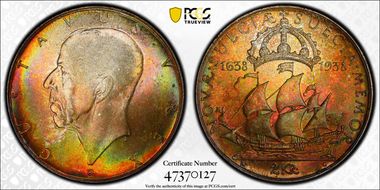
Stunning color on a this Swedish 2 Kronor celebrating the 300th Anniversary of the landing of the Swedes & Finns in Delaware. Featuring the Kalmar Nyckel and King Gustaf V. The Latin inscription on the reverse (the side with the ship), “NOVÆ SUECIÆ SUECIA MEMOR”, translates as “Sweden Remembers New Sweden”. Latin hadn’t appeared on a Swedish coin since the time of Gustav III in the late 18th century. The years 1638 and 1938 are featured on either side of the ship, a nod to the tercentenary. The ‘G’ privy mark below the ship’s stern stands for mint master Alf Gerhard Grabe. Below the bow, the St. Erik mintmark indicates the coin was minted in Stockholm. Above the Kalmar Nyckel is a depiction of the royal crown. Erik Lindberg’s Kalmar Nyckel is more angular and svelte than Carl Schmitz’s design. It’s a model of efficiency to get settlers to their destination safely and quickly. Sweden’s King Gustav V, who attended the 1938 celebration in Delaware, is featured on the obverse. Around the King’s portrait is “GUSTAVUS V REX”, Latin for “King Gustaf V.” Below the neckline of the King’s portrait are the designer’s initials, EL (Erik Lindberg).
Yes, someone scratched a "2," or maybe it's someone's initials "HU" (I can't tell which), onto the obverse. Maybe an ambitious toddler destroyed a family member's coin. Maybe someone thought it was funny to do without realizing it would be collected years later. We may never know why. But that detail is easily overlooked by the coin's overall condition. In hand it's vitually impossible to see without very VERY bright light. The details are wonderful and there is only some light striking in the "O" of OF on the reverse.
Yes, someone scratched a "2," or maybe it's someone's initials "HU" (I can't tell which), onto the obverse. Maybe an ambitious toddler destroyed a family member's coin. Maybe someone thought it was funny to do without realizing it would be collected years later. We may never know why. But that detail is easily overlooked by the coin's overall condition. In hand it's vitually impossible to see without very VERY bright light. The details are wonderful and there is only some light striking in the "O" of OF on the reverse.
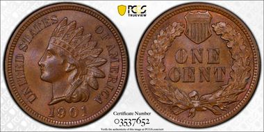
A touch of the original factory finish peeks through this mostly chocolate brown Indian Head cent. Good strike with clear "LIBERTY", headband definition, and hair definition. "9" in 1901 is a little rounded like maybe the date was re-punched, but rest of words are very sharp.
While this is a perfectly fine example, my MS-67 1943-P Steel Cent has a die clash and some die cracks that add extra visual interest. Unfortunately it's in an NGC holder, so it can't be added here to show.
While this is a perfectly fine example, my MS-67 1943-P Steel Cent has a die clash and some die cracks that add extra visual interest. Unfortunately it's in an NGC holder, so it can't be added here to show.
I bought this because it was nice, but also as a reminder of my love for Back to the Future.
I bought this because it was nice, but also as a reminder of my love for Back to the Future.
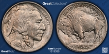
Good strike, subtle gold and blue toning on obverse. Full stars and kernels of left cob corn show.
Good strike, subtle gold and blue toning on obverse. Full stars and kernels of left cob corn show.
Good strike, subtle gold and blue toning on obverse. Full stars and kernels of left cob corn show.
Good strike, subtle gold and blue toning on obverse. Full stars and kernels of left cob corn show.
One of my favorite things about the Buffalo Nickel is that it looks as if it's chiseled from stone. So even though there can often be a less-than-ideal strike, like with nearly all nickels, they feel organic and natural. Softer strikes on other coins with a more precise design suffer, like the Jefferson nickel, but James Earle Fraser's design benefits from the look. There's a slight die rotation, but nothing spectacular. There is some subtle toning and there is decent luster on this coin.
One of my favorite things about the Buffalo Nickel is that it looks as if it's chiseled from stone. So even though there can often be a less-than-ideal strike, like with nearly all nickels, they feel organic and natural. Softer strikes on other coins with a more precise design suffer, like the Jefferson nickel, but James Earle Fraser's design benefits from the look. There's a slight die rotation, but nothing spectacular. There is some subtle toning and there is decent luster on this coin.
One of my favorite things about the Buffalo Nickel is that it looks as if it's chiseled from stone. So even though there can often be a less-than-ideal strike, like with nearly all nickels, they feel organic and natural. Softer strikes on other coins with a more precise design suffer, like the Jefferson nickel, but James Earle Fraser's design benefits from the look. There's a slight die rotation, but nothing spectacular. There is some subtle toning and there is decent luster on this coin.
This is a wonderful coin. I bought it by accident due to sloppy clicking when I wanted to bid on the MS-65 I bought the same day.
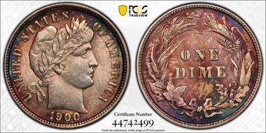
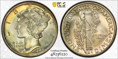
Beautiful red, green, blue, and purple toning that accentuates the devices on both the obverse and reverse. Nice luster overall. The very first coin I ever bought was a Barber Dime, so these are very special to me.
Pretty gold, blue, and green toning on the edges of both of obverse and reverse. It's also a really nice strike with good luster. Personally I think it's worthy of a Full Bands designation, but I think it's a pretty coin no matter what.
The blue toning is what drew me to this particular quarter. I love it on any coin and, if you look through some of my others, you'll see what I see.
The Walking Liberty is one of my favorite coin designs and this example's sparking luster makes it one of the standouts of my collection.
The Walking Liberty is one of my favorite coin designs and this example's sparking luster makes it one of the standouts of my collection.
Attractive pastel blues, deep blue greens, gold, rose, and lavender colors on obverse. Lavender and gold on reverse.
Attractive pastel blues, deep blue greens, gold, rose, and lavender colors on obverse. Lavender and gold on reverse.
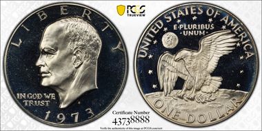
This was clearly part of someone else's collection being sold because my 1973-S Silver Eisenhower was one auction listing number different AND the PCGS cert numbers are sequential. I found these two separately and I felt like they should be kept together, so I kept them together. That story in my head was enough to buy this and I'm happy about my decision. I have a nicer Type 2, but it’s in an NGC holder.
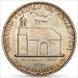
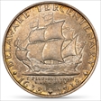
Nice golden toning around the edge, good luster and strike. In 1935, the Delaware Swedish Tercentenary Commission was created to make plans to celebrate the 300th anniversary of the landing of the Swedes. To help pay for the celebrations, a commemorative half dollar was to be minted and sold to collectors at a price of $1.75 each. In 1936, after Congress authorized the coin, a contest was announced for artists to submit their designs and win $500. The contest, which was published in the Delaware paper The News Journal, required that the obverse needed to be a ship modeled after the Kalmar Nyckel, the dates 1638 and 1938, and a diamond to represent the state’s other nickname of The Diamond State. The reverse needed to depict Old Swedes Church, the nation’s oldest church building in continuous use since it was consecrated in 1699. Of the 40 submissions, judges John Sinnock, the Mint’s Chief Engraver, and sculptor Dr. Robert Tait McKenzie selected artist Carl L. Schmitz’s designs. 25,015 coins were minted in Philadelphia, but only 20,993 were distributed. The remaining were returned to be melted. Carl Schmitz worked with the Public Works of Art Project (PWA) creating sculptures for government buildings. In 1932 he also worked under Swedish sculptor Carl Milles, the sculptor Sweden selected to create the Kalmar Nyckel monument now standing at Fort Christina in Wilmington, DE. Two of his pieces are in the Smithsonian, but the half dollar is likely his most well-known work. This was his only coin.
Nice golden toning around the edge, good luster and strike. In 1935, the Delaware Swedish Tercentenary Commission was created to make plans to celebrate the 300th anniversary of the landing of the Swedes. To help pay for the celebrations, a commemorative half dollar was to be minted and sold to collectors at a price of $1.75 each. In 1936, after Congress authorized the coin, a contest was announced for artists to submit their designs and win $500. The contest, which was published in the Delaware paper The News Journal, required that the obverse needed to be a ship modeled after the Kalmar Nyckel, the dates 1638 and 1938, and a diamond to represent the state’s other nickname of The Diamond State. The reverse needed to depict Old Swedes Church, the nation’s oldest church building in continuous use since it was consecrated in 1699. Of the 40 submissions, judges John Sinnock, the Mint’s Chief Engraver, and sculptor Dr. Robert Tait McKenzie selected artist Carl L. Schmitz’s designs. 25,015 coins were minted in Philadelphia, but only 20,993 were distributed. The remaining were returned to be melted. Carl Schmitz worked with the Public Works of Art Project (PWA) creating sculptures for government buildings. In 1932 he also worked under Swedish sculptor Carl Milles, the sculptor Sweden selected to create the Kalmar Nyckel monument now standing at Fort Christina in Wilmington, DE. Two of his pieces are in the Smithsonian, but the half dollar is likely his most well-known work. This was his only coin.
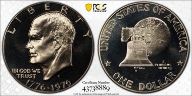
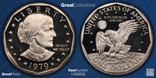
Excellent blue and green toning. Like my 1979-S Type 2 SBA, the Apollo 11 insignia is enhanced by the color.
I love all 1979 coins, so that's why I bought this. But my first-year-of-issue 1938-D Jefferson, graded MS-67, in an NGC holder is by far more impressive.
I love all 1979 coins, so that's why I bought this. But my first-year-of-issue 1938-D Jefferson, graded MS-67, in an NGC holder is by far more impressive.
I love all 1979 coins, so that's why I bought this. But my first-year-of-issue 1938-D Jefferson, graded MS-67, in an NGC holder is by far more impressive.
I love all 1979 coins, so that's why I bought this. But my first-year-of-issue 1938-D Jefferson, graded MS-67, in an NGC holder is by far more impressive.
Fun fact: Cert # 04262099 is a $50,000 coin, which I entered mistakenly. I'm sure it's wonderful, but I DO NOT OWN IT!
Fun fact: Cert # 04262099 is a $50,000 coin, which I entered mistakenly. I'm sure it's wonderful, but I DO NOT OWN IT!
This was the first coin of the US Mint’s new 50 State Quarters Series, released on Jan. 4, 1999. The legislation that authorized the state quarter program in 1997 was introduced by Delaware Representative Mike Castle. Each state’s governor was responsible for submitting concepts to the mint, but they had leeway on how they came to those selections. Delaware’s Governor asked residents to submit ideas to the Delaware Arts Council for review. Once the US Mint finalized three potential designs for the reverse, Delawareans were asked to vote on their favorites. Of the 1,519 votes cast, the Caesar Rodney reverse, engraved by William Cousins and based on artist Eddy Seger’s submission, received 948. Both the final design and the original submission were based on James Edward Kelly’s sculpture of Caesar Rodney that stood in Wilmington’s Rodney Square between 1923 until 2020. Mr. Seger taught at art at Caesar Rodney High School in Camden, DE at the time. When he learned that Delawareans were being asked to submit ideas for the new coin, he made it an art project. Of the 340 submissions to the Arts Council, 39 came from his students. The ceremonial first strike of the new series took place at the Philadelphia Mint on Dec. 7, 1998, the anniversary of the state’s ratification of the Constitution.
This was the first coin of the US Mint’s new 50 State Quarters Series, released on Jan. 4, 1999. The legislation that authorized the state quarter program in 1997 was introduced by Delaware Representative Mike Castle. Each state’s governor was responsible for submitting concepts to the mint, but they had leeway on how they came to those selections. Delaware’s Governor asked residents to submit ideas to the Delaware Arts Council for review. Once the US Mint finalized three potential designs for the reverse, Delawareans were asked to vote on their favorites. Of the 1,519 votes cast, the Caesar Rodney reverse, engraved by William Cousins and based on artist Eddy Seger’s submission, received 948. Both the final design and the original submission were based on James Edward Kelly’s sculpture of Caesar Rodney that stood in Wilmington’s Rodney Square between 1923 until 2020. Mr. Seger taught at art at Caesar Rodney High School in Camden, DE at the time. When he learned that Delawareans were being asked to submit ideas for the new coin, he made it an art project. Of the 340 submissions to the Arts Council, 39 came from his students. The ceremonial first strike of the new series took place at the Philadelphia Mint on Dec. 7, 1998, the anniversary of the state’s ratification of the Constitution.
I knew I had to have this as soon as I saw it. I likely paid more than I should have for this, but the year, variety, and condition were all right for me. Building a collection that's personal to you and that you feel good about is important.
I knew I had to have this as soon as I saw it. I likely paid more than I should have for this, but the year, variety, and condition were all right for me. Building a collection that's personal to you and that you feel good about is important.
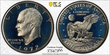
Has some light blue toning towards top of obverse. Otherwise a pretty basic Eisenhower dollar.
Has some light blue toning towards top of obverse. Otherwise a pretty basic Eisenhower dollar.
Really pretty blue and green toning around edges of both obverse and reverse. The Apollo 11 insignia on reverse really stands out like it's in space. One of my favorite coins.
Really pretty blue and green toning around edges of both obverse and reverse. The Apollo 11 insignia on reverse really stands out like it's in space. One of my favorite coins.
My first year of issue 1979-S Type 2 is much more exciting to look at, with blues and golds, but this example is more pristine.
My first year of issue 1979-S Type 2 is much more exciting to look at, with blues and golds, but this example is more pristine.
Like my 1979 Type 2 SBA, nice blue toning. More of a daytime sky effect on the reverse.
Like my 1979 Type 2 SBA, nice blue toning. More of a daytime sky effect on the reverse.
This has a minor die crack on the reverse through the "T" in "CENT".
The America the Beautiful Quarters program, introduced in 2010, depicted national parks or sites through 2021. Five designs were released each year in the order that the parks were established. The decision to feature Bombay Hook was made in 2010, five years before the quarters were issued. The Bombay Hook National Wildlife Refuge, one of the largest tidal salt marshes in the mid-Atlantic, was established in 1937. It received its name from the Dutch phrase "Boompjes Hoeck”, which sounds like Bombay Hook, meaning "little-tree point. A Blue Heron and a Great Egret are featured on the reverse, which are common birds in the summer. It was designed by Joel Iskowitz and sculpted by Phebe Hemphill.
The America the Beautiful Quarters program, introduced in 2010, depicted national parks or sites through 2021. Five designs were released each year in the order that the parks were established. The decision to feature Bombay Hook was made in 2010, five years before the quarters were issued. The Bombay Hook National Wildlife Refuge, one of the largest tidal salt marshes in the mid-Atlantic, was established in 1937. It received its name from the Dutch phrase "Boompjes Hoeck”, which sounds like Bombay Hook, meaning "little-tree point. A Blue Heron and a Great Egret are featured on the reverse, which are common birds in the summer. It was designed by Joel Iskowitz and sculpted by Phebe Hemphill.
