Aesthetics in US Coin Design
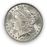
From humble beginnings in 1792, the local tradesman of the US mint quickly elevated the art with their likenesses of liberty and simple, balanced reverses, designs reflecting a fledgin nation. By the late 1830’s, engravers such as Christian Gobrecht working with major artists introduced the dignified Neoclassic Seated Liberty designs that symbolized American numismatic art during the generations of westward expansion, the Civil War, and the industrial age. Gobrecht’s successor, James Longacre did not venture far artistically, but the Flying Eagle and the Indian Cent resonated. Another favorite is George Morgan's silver dollar, brought to us by political pressures from the silver lobby towards the end of the century.
In 1904, President Theodore Roosevelt said, “I think our coinage is artistically of atrocious hideousness.” A renaissance in design was birthed. His friend, Augustus Saint Gaudens, a renowned sculptor was chosen for a new series of designs beginning with the $10 and $20 gold eagles. Bela Lyon Pratt designed the $2 ½ and $5 gold pieces in a Native American theme. James Earle Fraser’s Buffalo Nickel design followed suit. Three new designs in 1916 – Adolph Weinman's Mercury Dime, and Walking Liberty Half Dollar as well as Herman MacNeil's Standing Liberty Quarter gave the United States a magnificent series of coins from the cent to the $20 gold that rival those of any other time, including succeeding designs which have typically depicted renditions of our founding fathers, eg, the Washington Quarter.
| User Order | 图片 | PCGS # | 描述 | 评级 | 数量 | 更高评级数量 | 留言 |
|---|


留言