The Gem State 20th Century Type Set 的钱币相册
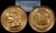
Some coins are tremendously enjoyable beyond what can be described by a numerical grade. This one looks like it was pulled from a fresh roll yesterday. Sharp strike, even, smooth coloration and no distracting carbon spots make it truly exceptional. From Dave Wnuck.
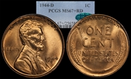
Once common in circulation, the mighty wheat cent is now only rarely encountered. Brenner's design was the first departure from an allegorical figure of Liberty on US coinage. This example demonstrates tremendous luster, full red coloration, and sharp details.
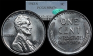
The zinc-coated steel cents are rather unique in the history of US coins. While they are subject to corrosion and spotting, some have survived in incredible condition. This example boasts clean surfaces, sharp detail, and swirling chrome-like luster. Die polish lines are evident in the fields - vertically oriented on the obverse with horizontal lines on the reverse.
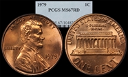
Pre-82 Memorial Cents are the most familiar coins to a generation of circulation collectors.
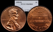
Roughly one-half trillion Lincolns have been produced. Almost none have a level of detail and strike quality to compare with this one. Deep, flashy luster completes the effect. This little coin represents the pinnacle of the US Mint's 20th Century business-strike craftsmanship.
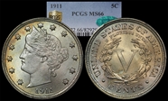
This little coin is an absolute jewel. Glacier-blue toning meets gold against the rim and violet-rose hues over the portrait. In-hand luster really pops. The little toning spot below and to the left of the V is only visible at certain angles.
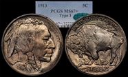
The buffalo nickel is an American classic, and arguably the most successful of the "Renaissance" coins in terms of public recognition and uniform appeal. This example is stellar, with sharp detail, beautiful color, and flashy luster.
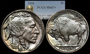
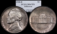
For a type set, everyone does the 38-D. Well, everyone except me. Sometimes opportunity knocks. This buffalo is really fun to look at. The detail is tremendous, there's a bit of color, and there's not a thing distracting about it.
While not as beautiful as the Buffalo design, the Jefferson Nickel is the least objectionable of the modern "Politician" coins in my opinion. This example is superb, with deep luster and almost perfect design details. It's hard to believe the design is almost 80 years old.
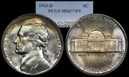
The added silver gives war nickels a different look with deeply lustrous surfaces and nice patina. This example demonstrates reverse die polish lines and exceptional detail.
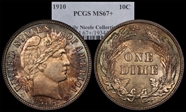
Ex. Duckor. This little coin is just incredible with sharp detail and virtually perfect surfaces. Brilliant luster erupts through a nice golden patina. One one example has graded higher, a beautiful 68+ from the Simpson collection.
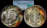
The talents of Mr. Weinman are masterfully displayed in this timeless renaissance design. This superb jewel sports blazing, penetrating luster that boasts vibrant splashes of color. One trivial hit on the fasces is all that keeps this coin apart from the finest known in the entire series.
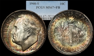
The Roosevelt dime is not a terribly popular coin and the design seems to be stuck in perpetuity. This example demonstrates really incredible in-hand luster and color that photographs don't depict well. Photos also over-emphasize slight luster breaks on FDR's cheek.
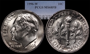
This 1996 issue is the first and only US dime to feature a W mintmark. The 1996-W also has the lowest mintage within the Roosevelt series. This example is well-struck with nearly perfect surfaces.
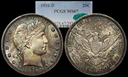
This coin is just fun to examine. Detail is good with just a touch of softness on star 11, the upper-right of the shield (which is almost universal) and the eagle's left claw. Color is exceptional with shades of silver-green and pink. Luster really pushes this coin into the upper grades and cascades over the surfaces nicely. A few linear toning breaks could easily be mistaken for scratches, but there is no disturbance of metal or luster in these areas. The 16-D is a common coin in gem condition, but this example is a cut above.
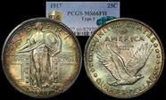
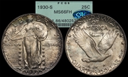
What a wonderful, gorgeous, stunning coin! Eye appeal is off the charts. SLQ's simply do not come like this. The coin is hammered, insanely lustrous, and technically excellent. Some examples might be graded higher, but it would be virtually impossible to find one better. From Tom Bush.
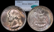
A glowing salmon/cinnamon patina adds to the nearly flawless surfaces of this Washington. Other than a touch of softness of detail in the eagle's breast feathers there isn't much to complain about here. From Larry Shapiro.
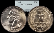
About as close to perfection as clad gets. The spaghetti-hair design isn't quite as nice as the original, but this example is solidly struck and virtually mark-free.
A nice coin with an almost satin-prooflike obverse and a lustrous reverse.
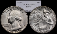
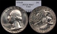
The quarter is the nicest of the bicentennial designs in my opinion. This piece shows great detail, clean fields, and bright luster with chrome-like surfaces.
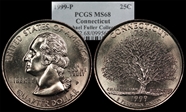
The 1999 Statehood Quarters were not made to the same quality as coins in later years. Most of these are covered in bagmarks and otherwise unattractive. The Connecticut is a nice design that features the Charter Oak. This example is technically nice with a few light marks and strong details.
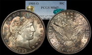
The Barber Half is the most difficult coin in a 20th Century type set. Gem examples are common, but coins at the MS67 level become quite scarce. This example sports an incredibly nice strike for any Barber half and detail is particularly nice for a New Orleans coin. All of the stars have sharp centers, with only the eagle's left foot and upper-right corner of the shield showing only the slightest weakness. Cartwheel luster is exceptionally bright and lively. Nice color adds considerably to the eye appeal with nice blues and pinks, and soft peach tones over the portrait. Pull-away toning is notable around devices on both sides. One of my favorites.
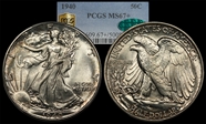
Walkers are some of my favorite coins, especially the early dates. For a type coin, this one makes the cut. The design is easily in my top 5 of all US coins. This example is well-struck with just a bit of typical weakness on the hand and chest of the eagle. Luster in-hand is really nice and cascading. A bit of rim toning adds to the effect.
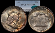
The Franklin Half is a strange coin, with a ridiculously small eagle and flat, bland obverse. The coin honors a great American and fits squarely between the beautiful Renaissance Walking Liberty and the modern politician Kennedy design. This example is superb, with deep luster emanating through fantastic color. From Larry Shapiro.
A splendid example of a design that is getting tired. Luster and strike are quite nice and overwhelm the few miniscule hits.
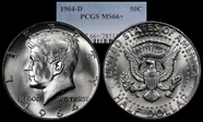
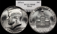
The silver-clad Kennedy is a bit of an oddity in US coinage, representing the monumental shift from silver to base metal composition. While not a slave to colorful coins, I don't ignore them either. This example is visually stunning and technically excellent on its own merits. Interesting die-polish is seen below the designer's initials.
Coins like this one could get a person interested in collecting moderns. If only they all looked like this one.
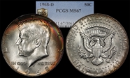
Perhaps the most lusterous, flashy silver coin in my collection. This example is a nice example of what a Kennedy Half should be.
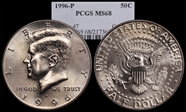
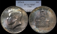
Who says clad can't be pretty? This coin is something truly special. Gorgeous pastel colors pop beneath outstanding luster. Extensive reverse die polish adds character. From James Sego.
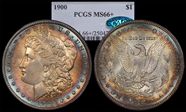
For some reason I prefer Peace Dollars, but this Morgan is a great example. Strike is slightly soft, but the toning and surfaces are nice.
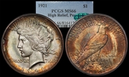
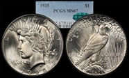
A collection is defined by its key dates and this is especially true of the 1921, the only coin in the series true to de Francisci's original design. This example has stellar luster and is beautifully toned in shades of gold, green, and magenta. This coin surely sat for years in an album. A real American Beauty! Sadly, this is the last of our nation's coin designs to feature Liberty and the last true silver dollar. From a Heritage Auction with help from Mark Feld.
Wow, what a coin! Peace dollars like this one are few and far between. This is the only Peace dollar I've personally seen with NO frost breaks. One little reedmark in the hair is the only visible flaw. Interesting die polish is noted around "IN GOD". From Larry Shapiro... He liked it so much it's featured in the logo of his website. ;)
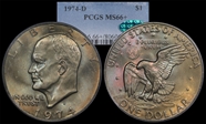
The unloved Ike is considered common by many, but high-grade examples are surprisingly elusive. Coins with outstanding character and color are even more challenging. This fantastic piece sports salmon-pink highlights over a background patina of golden olive hues.
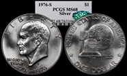
1976 Mint State Ikes just don't come any nicer than this! From James Sego.
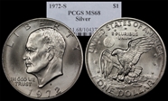
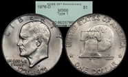
The Type I Ike Dollar was made with bold, block lettering on the reverse. The variety is less commonly encountered in high grades. This example is nice, with good luster, sharp detail and no distracting marks.
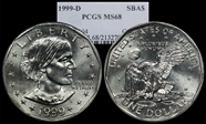
A failure by any standard, this little coin was unpopular the moment it was issued. The borrowed reverse and poor Ms. Anthony's gargantuan forehead did nothing to help its cause. This example is technically excellent, devilishly hard to photograph, and, sadly, seems a sorry end to a beautiful century of our nation's coinage.
