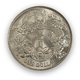
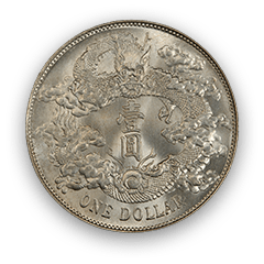


The Bighorn Collection 的钱币相册
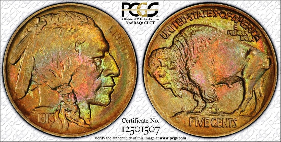
One thing to remember when viewing this particular coin: the color in the photo is not 'juiced' in any way, and more importantly, the colors are 'original'. The coin was literally graded and slabbed by PCGS in the last few months, and as we all are aware, the service is not letting any coin with this level of color in their holders without a certainty as to the authenticity. From my own eye, the coin surface has a thick and crusty skin, and the original luster that comes through the colors is pure 'blast', from any angle that one can turn and/or view the coin. It is a remarkable specimen, and most likely, unique. Obverse and reverse are evenly toned, and the surface is more 'satin' than pure matte, in my opinion. The striking details are full and decent, but the Type I is not known for typically having an extraordinary strike, like one might see in the '15 or '16. I'm going to submit the entire collection for serial number consistency and Tru-views in the near future. In terms of equating to MPLs, Nickel tones differently (even though the coin is made of more copper than nickel, ironically). This coin shows some of the hard to find colors in this series - specifically, the lime greens and the orange-magenta family colors are rare. The blues are also very rare, but extremely beautiful, and can be seen on a few spots on this coin. The coin does possess stray diagnostic lines in different locations, and I'm doing a study on some of the die lines now. Each one of the coins in the collection is unique, and one coin (the 1914) is actually concentrically-toned on both obverse and reverse, if you can imagine. Still, some of the others years are not heavily toned, but make up for the lack of color in different ways; for example, one has the most fantastic detailed strikes imaginable. So I will work on the collection from descriptive, historical and education perspectives, and see if I can't persuade some of my fellow matte Lincoln collectors that there is some awesome beauty and symbolism in this series, which is similar, but still different enough from the MPL series to make the collecting challenging and interesting. I see the series as different from the copper coins, but just a compelling and beautiful within a different set of rules.
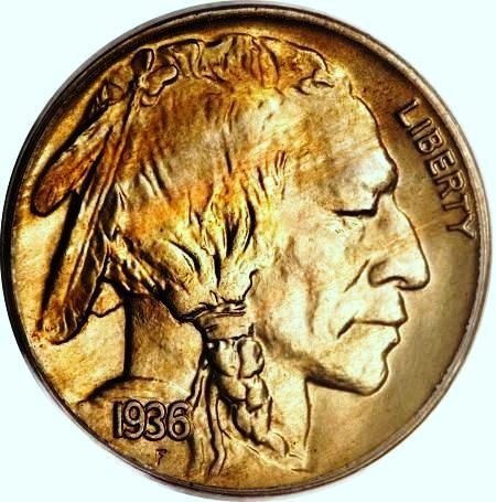
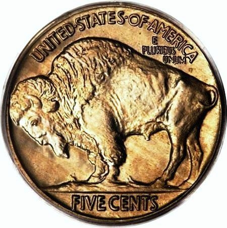
Many ‘true matte proof’ collectors look at the 1936 satin with disdain. It’s not a ‘real’ matte proof, right? Well, this coin dispelled a few misconceptions for me. Honestly, I’m not sure which element of this coin fascinates me the most. Color: The obverse, primarily. The coin has an assortment of colors, but the coolest is a bright copper-colored streak that runs at an upward diagonal from 8:00 - 2:00 O’clock across the top of the Indian’s face and hair. One spot of iridescent green ended up in the part in the Indian’s hair at roughly 12:00. Very nice. The texture is definitely somewhere between a matte and brilliant proof. The reverse fields are nicely satin-textured and have an array of die striations in almost every flat-surfaced field area of the coin. While the striations are stronger on the reverse, a few very pronounced striations can be seen running in semi-circles to the left of the “E” in “E PLUIBUS”. The reverse color is more of the copper/gold on the bison’s head and specifically facial are over the beard, with a very subtle green streak running from the grassy ground upwards to the bison’s mouth – obviously a well-fed animal. So, as to any trepidation I may have had towards the 1936 Satin Proof Buffalo Nickel, to paraphrase the 1960s group the Monkees: “Then I saw [his] face, now I’m a believer…..” Thank you, Todd Imhof.
Many ‘true matte proof’ collectors look at the 1936 satin with disdain. It’s not a ‘real’ matte proof, right? Well, this coin dispelled a few misconceptions for me. Honestly, I’m not sure which element of this coin fascinates me the most. Color: The obverse, primarily. The coin has an assortment of colors, but the coolest is a bright copper-colored streak that runs at an upward diagonal from 8:00 - 2:00 O’clock across the top of the Indian’s face and hair. One spot of iridescent green ended up in the part in the Indian’s hair at roughly 12:00. Very nice. The texture is definitely somewhere between a matte and brilliant proof. The reverse fields are nicely satin-textured and have an array of die striations in almost every flat-surfaced field area of the coin. While the striations are stronger on the reverse, a few very pronounced striations can be seen running in semi-circles to the left of the “E” in “E PLUIBUS”. The reverse color is more of the copper/gold on the bison’s head and specifically facial are over the beard, with a very subtle green streak running from the grassy ground upwards to the bison’s mouth – obviously a well-fed animal. So, as to any trepidation I may have had towards the 1936 Satin Proof Buffalo Nickel, to paraphrase the 1960s group the Monkees: “Then I saw [his] face, now I’m a believer…..” Thank you, Todd Imhof.